By Keenan Viney
With the cost of satellite launches falling quickly, high-quality imagery is becoming more available. I wanted to explore an area with some industrial application. This post will take a look at whether its possible to predict aluminum production with open source thermal imagery.
I chose to look at the Talco plant in Tajikistan, because I have been to the factory and because Tajikistan is a very sunny country; clouds being the bane of much remote sensing. Gathering what production data was possible to find online and, where possible, checking multiple sources, here is the plant’s production:
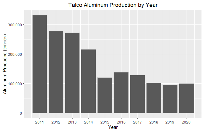
There is a good amount of variation in the response variable here, partly as result of a collapse in aluminum prices in 2014 and post-Soviet malaise that has seen most of Talco profits end up in a bank account in the Cayman Islands. The location of the factory made more sense in Soviet times, Tajikistan has no large Bauxite reserves and relies on imports from Uzbekistan, which have been used as political leverage. For context, the reported production in 1989 was 460,000 tonnes which was still short of the design capacity of 517,000 tonnes. A lot of the economy of Tajikistan revolves around this plant, it has pushed the country to build a large hydroelectric infrastructure and the factory often consumes the majority of the total energy produced leading to brownouts in the winter for the rest of the country.
Downloading Imagery
To download LandSat 8 imagery, I setup an account with USGS and found the area that I wanted images for using their Earth Explorer tool which works similar to Google Earth. Downloading imagery can be done programmatically in R but I didn’t have much luck with any of the packages that I tried, so I just manually selected all of the imagery bundles that I wanted and did a bulk download.
Imagery Processing
With all of the image bundles downloaded the first thing is to unzip all of them, I used this in Powershell:
$zipInputFolder = 'C:\Users\KV\Desktop\Talco Image Analysis'
$zipOutPutFolder = 'C:\Users\KV\Desktop\Talco Image Analysis\Unzipped'

$zipFiles = Get-ChildItem $zipInputFolder -Filter *.zip
 #get all files

foreach ($zipFile in $zipFiles) {
    $zipOutPutFolderExtended = $zipOutPutFolder + "\" + $zipFile.BaseName
    Expand-Archive -Path $zipFile.FullName -DestinationPath $zipOutPutFolderExtended
    }
The unzipped directories should look something like this:
PS C:\Users\KV\Desktop\Talco Image Analysis\LC08_L1TP_154033_20140929_20200910_02_T1> ls -Name
LC08_L1TP_154033_20140929_20200910_02_T1_ANG.txt
LC08_L1TP_154033_20140929_20200910_02_T1_B1.TIF
LC08_L1TP_154033_20140929_20200910_02_T1_B10.TIF
LC08_L1TP_154033_20140929_20200910_02_T1_B11.TIF
LC08_L1TP_154033_20140929_20200910_02_T1_B2.TIF
LC08_L1TP_154033_20140929_20200910_02_T1_B3.TIF
LC08_L1TP_154033_20140929_20200910_02_T1_B4.TIF
LC08_L1TP_154033_20140929_20200910_02_T1_B5.TIF
LC08_L1TP_154033_20140929_20200910_02_T1_B6.TIF
LC08_L1TP_154033_20140929_20200910_02_T1_B7.TIF
LC08_L1TP_154033_20140929_20200910_02_T1_B8.TIF
LC08_L1TP_154033_20140929_20200910_02_T1_B9.TIF
LC08_L1TP_154033_20140929_20200910_02_T1_MTL.json
LC08_L1TP_154033_20140929_20200910_02_T1_MTL.txt
LC08_L1TP_154033_20140929_20200910_02_T1_MTL.xml
LC08_L1TP_154033_20140929_20200910_02_T1_QA_PIXEL.TIF
LC08_L1TP_154033_20140929_20200910_02_T1_QA_RADSAT.TIF
LC08_L1TP_154033_20140929_20200910_02_T1_SAA.TIF
LC08_L1TP_154033_20140929_20200910_02_T1_stac.json
LC08_L1TP_154033_20140929_20200910_02_T1_SZA.TIF
LC08_L1TP_154033_20140929_20200910_02_T1_thumb_large.jpeg
LC08_L1TP_154033_20140929_20200910_02_T1_thumb_small.jpeg
LC08_L1TP_154033_20140929_20200910_02_T1_VAA.TIF
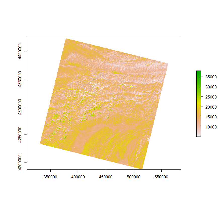
LC08_L1TP_154033_20140929_20200910_02_T1_VZA.TIFJust to get an idea of what one of the raster files looks like, here is band 6, which is short wave infrared:
One other thing that need to be done before processing the images was to create a shapefile of the area of interest. This ended up being quickest to do in QGIS because the area of the factory is a rather irregular shape. The shapefile also contains the same shape duplicated and moved over to Tursunzoda, which is the company town nearby, as well as a shape sitting over some nearby cotton fields. The thinking behind this, is that it would give some additional control points in the analysis. If the Talco plant was hotter because of buildings then that could be compared to the nearby city, and both might have some degree of heat island effect1 that wouldn’t be present in the cotton fields.
With all of the imagery scenes unzipped and the shapefile required to crop the images, we can step through the processing script before returning to the main script that runs this process. To start off with the script take the name of the working directory from the main script which will be an unzipped Landsat scene directory:
working_directory_argument <- commandArgs(trailingOnly = TRUE)

setwd(working_directory_argument)
Then loading in the necessary libraries, raster is, unsurprisingly, what will be used for the raster manipulation like cropping and calculating the temperature, where as rgdal will just be used to work with the shapefile used for cropping. There is also a strange file format that Landsat provides for their QA raster, that is why the binaryLogic library is loaded.
library(raster)
library(rgdal)
library(tidyverse)
library(lubridate)
library(binaryLogic)
I built a function here to import the required raster images as well as the meta data. Band 10 and 11 are the Landsat thermal images, while the QA raster has information about the quality of each pixel. The meta data is necessary to fill in the output file and there are constants needed in order to correct the thermal images into a usable form.
## Load Meta and Raster Data ----

file_importer <- function(file_name_matching){

  file_name <- list.files() %>% str_extract(.,file_name_matching) %>% na.omit()

  if (str_detect(file_name, ".*MTL\\.txt") == TRUE)
    {Meta_data <- read.table(file_name, header = FALSE, sep = "\t", fill =  FALSE, strip.white = TRUE, stringsAsFactors = FALSE)}

  else if (str_detect(file_name, ".*\\.TIF") == TRUE) {raster(file_name)}
}


Meta_data <- file_importer(".*MTL\\.txt")

band_10 <- file_importer(".*B10\\.TIF")

band_11 <- file_importer(".*B11\\.TIF")

qa_pixel <- file_importer(".*QA_PIXEL\\.TIF")
Eleven different meta data values need to be collected, those in the list “Target_variables” are all in scientific notation and, other than cloud cover, are all subsequently used in correcting the temperature raster. It was also convenient to grab the image capture date and product ID from the meta data file, both could be read off the directory name but the regex was a little shorter doing it this way.
## Collect Values from Metafile ----

Meta_data_parser <- function(Input_Table, Variable_Name) {
  Input_Table %>%
    filter(str_detect(V1, Variable_Name)) %>%
    str_remove(Variable_Name) %>%
    str_extract("-?[0-9.]+E?[-+]?[0-9]*") %>%
    as.numeric()
}

Target_variables <- c("RADIANCE_MULT_BAND_10","RADIANCE_MULT_BAND_11",
                      "RADIANCE_ADD_BAND_10","RADIANCE_ADD_BAND_11",
                      "CLOUD_COVER","K1_CONSTANT_BAND_10",
                      "K1_CONSTANT_BAND_11","K2_CONSTANT_BAND_10",
                      "K2_CONSTANT_BAND_11")

for(i in seq_along(Target_variables)) {
    assign(paste0(i), Meta_data_parser(Meta_data ,Target_variables[[i]]))
}

LandSat_Product_ID <- Meta_data %>%
  filter(str_detect(V1, "LANDSAT_PRODUCT_ID")) %>%
  distinct() %>%
  str_remove(paste0("LANDSAT_PRODUCT_ID"," = ")) %>%
  str_extract(".*")

Image_Capture_Date <- Meta_data %>%
  filter(str_detect(V1, "DATE_ACQUIRED")) %>%
  str_remove(paste0("DATE_ACQUIRED", " = ")) %>%
  str_extract("[0-9]{4}-[0-9]{2}-[0-9]{2}") %>%
  ymd()
There are two separate corrections to do to the thermal bands, they have been left separate to be a bit more readable as one-liners. The Top of Atmosphere Reflectance is more or less what you might imagine; it is ratio of the thermal radiation reflected compared to the incident solar radiation, for the particular image and spectral band. The Brightness Temperature is a longer story, it can be thought of converting from the spectral radiance of an ideal black body to the brightness temperature of a grey body, this function also subtracts 273.15 to change the units from Kelvin to Celsius. Finally, we have a raster that has a temperature in Celsius for each pixel, the final function takes the average temperature for the entire extent of the raster. Only band 10 is being shown here but the same function are also applied to band 11.
## Correct for Top of Atmosphere Reflectance ----

toa_band10 <- calc(band_10, fun=function(x){RADIANCE_MULT_BAND_10 * x + RADIANCE_ADD_BAND_10})

## Calculate At Satellite Brightness Temperature ----

#Convert LST in Celsius for Band 10
temp10_celsius <- calc(toa_band10, fun=function(x){(K2_CONSTANT_BAND_10/log(K1_CONSTANT_BAND_10/x + 1)) - 273.15})

## Full Raster Summary Statistics ----

Full_Area_Mean_Band_10 <- mean(values(temp10_celsius), na.rm = TRUE)
Now that a raster for with temperatures in celsius has been generated for the entire scene it is time to use the previously defined shape file to measure the mean temperature. The values of each extent are read at the Talco plant as well as the temperature in Turnsunzoda and the surrounding cotton fields as control.
## Crop temperature raster based on area of interest shapefile ----
# import the vector boundary

crop_extent <- readOGR("~\Selected_Area_Shapefile.shp")

# Band 10

Talco_Field_Band_10 <- raster::extract(temp10_celsius, crop_extent[crop_extent$PlaceName == 'Talco',], fun = mean, na.rm = TRUE)

Tursunzoda_Band_10 <- raster::extract(temp10_celsius, crop_extent[crop_extent$PlaceName == 'Tursunzoda',], fun = mean, na.rm = TRUE)

Cotton_Field_Band_10 <- raster::extract(temp10_celsius, crop_extent[crop_extent$PlaceName == 'Cotton',], fun = mean, na.rm = TRUE)
The next step is to calculate how many clouds are in the general area of Talco and Tursunzoda based on the Quality Assurance layer included with each scene. The way that clouds are coded into the raster is very unique. If you look at the values of this QA raster most likely you will get seemingly random five digit numbers. It turns out that different quality characteristics are encoded as an unsigned 16-bit binary, the first two bits are related to the cloud likelihood. The function below converts the first two bits into the probability of clouds being in that pixel, then the average cloud likelihood can be averaged across the area of interest extent.
## Cloud Occulusion Statistic----
Area_of_Interest_Clouds <- raster::extract(qa_pixel, crop_extent)
Cloud_Likelihood <- function(Raster_Value){
if (as.binary(Raster_Value, signed = FALSE, n = 16)[1:2] == as.binary(1, signed = FALSE, n = 2)) {17
} else if (as.binary(Raster_Value, signed = FALSE, n = 16)[1:2] == as.binary(2, signed = FALSE, n = 2)) {50
} else if (as.binary(Raster_Value, signed = FALSE, n = 16)[1:2] == as.binary(3, signed = FALSE, n = 2)) {83
} else if (as.binary(Raster_Value, signed = FALSE, n = 16)[1:2] == as.binary(0, signed = FALSE, n = 2)) {NA
} else {NA}
}
Average_Cloud_Likelihood_AOA <- map(flatten_dbl(Area_of_Interest_Clouds), Cloud_Likelihood) %>%
unlist() %>%
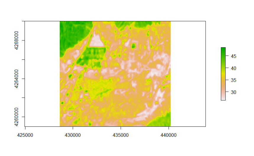
mean(., na.rm = TRUE)The final step of the image processing script crops down the temperature raster down to the area of interest extent and writes it to disk. Here is an example from a hot summer day in 2014, the outline of the plant is clearly visible in the middle of the top left quadrant:
In addition, all of the calculated values are collected in a single row table which will be collected for all the collection dates and used in the analysis section.
## Build a thermal raster for Talco Region

area_extent <- extent(c(428626, 440215, 4259000, 4270000))

Talco_Thermal_Band_10 <- crop(x = temp10_celsius, y = area_extent)

## Write the results ----

Results <- bind_cols(Image_Capture_Date, LandSat_Product_ID, Cloud_Cover, Talco_Field_Band_10, Tursunzoda_Band_10, Cotton_Field_Band_10, Talco_Field_Band_11, Tursunzoda_Band_11, Cotton_Field_Band_11, Full_Area_Mean_Band_10, Full_Area_Mean_Band_11, Average_Cloud_Likelihood_AOA) %>%
  rename("Image_Capture_Date" = "...1", "LandSat_Product_ID" = "...2", "Cloud_Cover" = "...3","Talco_Field_Band_10"= "...4",
"Tursunzoda_Band_10" = "...5", "Cotton_Field_Band_10" = "...6",  "Talco_Field_Band_11" = "...7", "Tursunzoda_Band_11" = "...8", "Cotton_Field_Band_11" = "...9",  "Full_Area_Mean_Band_10" = "...10",
"Full_Area_Mean_Band_11" = "...11", "Average_Cloud_Likelihood_AOA" = "...12")

write_csv(Results, path = paste0("C:\\Users\\Keenan Viney\\Desktop\\Project Folder\\Talco Image Analysis\\Results\\", Image_Capture_Date, "_Analytic_Results.csv"))

writeRaster(Talco_Thermal_Band_10, filename =
paste0("~\\Results\\",Image_Capture_Date,                    "_Talco_Band_10.tif"), format = "GTiff")
Analysis
The progression of the analysis was fairly open ended, with the general goal to establish a relationship between measured temperature and Talco’s production volume. The first plot to look at is both thermal bands over the complete period of observation. It is quite obvious that the high temperature summers have relatively smooth shapes, while the winter temperature measurement is highly variable, this is due to the significant amount of additional cloud cover in winter.
## Create a dataframe of the image processing results ----

Results_files = list.files(path = "C:\\Users\\Keenan Viney\\Desktop\\Project Folder\\Talco Image Analysis\\Results",
                           pattern = "csv$", full.names = TRUE)

Image_Processing_Results <- map_dfr(Results_files, read_csv)

## Plots to understand clouding threshold ----

Raw_Band_Averages <- Image_Processing_Results %>%
  filter(Image_Capture_Date <= as.Date("2019-12-31")) %>%
  dplyr::select(Image_Capture_Date, Talco_Field_Band_10, Talco_Field_Band_11) %>%
  gather(key = "Frequency", value = "value", -Image_Capture_Date)

ggplot(Raw_Band_Averages, aes(x = Image_Capture_Date, y = value)) +
  geom_line(aes(color = Frequency)) +
  scale_color_manual(values = c("darkred", "steelblue")) +
  ylab("Surface Temperature (Celsius)") +
  xlab("Image Capture Date") +
  ggtitle("Temperature Measurement of the Talco Plant") +
  theme(plot.title = element_text(hjust = 0.5)) +
  scale_color_discrete(labels = c("Band 10", "Band 11"))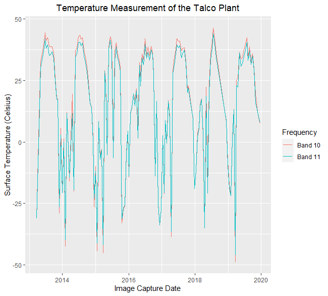
When there is cloud cover, the infrared radiation coming from the smelter doesn’t reach the satellite in orbit. There are two ways that I addressed cloud cover: The first was to filter the observations based on the percentage of clouds in the entire scene, which is part of each scene’s meta data. Here is an example that filters out observations from scenes that have more than 40% clouding:
## Temperature filtered by cloud likilhood----

Cloud_Threshold = 40

ggplot(filter(Image_Processing_Results, Average_Cloud_Likelihood_AOA < Cloud_Threshold),
       aes(x = Image_Capture_Date, y = Talco_Field_Band_10)) +
  geom_line() +
  ylab("Surface Temperature (Celsius)") +
  xlab("Image Capture Date") +
  ggtitle("Cloud Filter >40%") +
  theme(plot.title = element_text(hjust = 0.5)) +
  scale_color_discrete(labels = "Band 10")
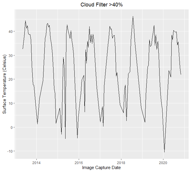
Using a full scene cloud filter helps show the effect of clouds generally but it is a blunt tool when looking at a small area compared to the relative size of the scene. For the remaining analysis, I used the pixel-wise quality assurance values that was discussed in the Imagery Processing section above. The code below generates a raster brick that stacks each thermal raster on top of the next, it can be animated to clearly show the change in heat across time, the factory is a clear signature in the top left corner of the animation.
Band_10_Rasters <- Image_Processing_Results %>% filter(Average_Cloud_Likelihood_AOA < Cloud_Threshold) %>%
  dplyr::select(Image_Capture_Date) %>%
  transmute(Raster_File_Name = paste0("C:\\Users\\Keenan Viney\\Desktop\\Project Folder\\Talco Image Analysis\\Results\\",
                                      Image_Capture_Date,"_Talco_Band_10.TIF")) %>% pull(Raster_File_Name)

Band_10_Brick <- brick()
for (i in seq_along(Band_10_Rasters)){
  read_band10_raster <- raster(Band_10_Rasters[i])
  raster10_to_brick <- brick(read_band10_raster)
  Band_10_Brick <- addLayer(Band_10_Brick, raster10_to_brick)
}

animate(Band_10_Brick, n = 1)
The final piece of analysis that I wanted to assess was how the temperature related to production. I addressed this by creating a novel feature that removed the regional ground heat as well as the heat island effect, see the variable Heat_Island_10. Using this metric, I decomposed the time series to remove seasonal variation, this allows for the comparison of the temperature trend with annual production in the same period.
## Temperature of the Talco plant versus yearly production ----

Quarterly_Metrics <- Image_Processing_Results %>%
  filter(Average_Cloud_Likelihood_AOA < Cloud_Threshold) %>%
  mutate(Year = year(Image_Capture_Date),
         Quarter = quarter(Image_Capture_Date),
         Month = month(Image_Capture_Date),
         Year_Quarter = paste(Year, Quarter, sep = "-"),
         Year_Month = paste(Year, Month, sep = "-")) %>%
  group_by(Year, Quarter) %>%
  summarize(Talco_10 = mean(Talco_Field_Band_10),
            Talco_11 = mean(Talco_Field_Band_11),
            Tursun_10 = mean(Tursunzoda_Band_10),
            Tursun_11 = mean(Tursunzoda_Band_11),
            Cotton_10 = mean(Cotton_Field_Band_10),
            Cotton_11 =  mean(Cotton_Field_Band_11)) %>%
  mutate(Heat_Island_10 = (Talco_10 - Cotton_10) - (Tursun_10-Cotton_10),
         Heat_Island_11 = (Talco_11 - Cotton_11) - (Tursun_11-Cotton_11))

## Decompose the filtered time series ----

Cloud_filtered_quarterly <- dplyr::select(Quarterly_Metrics, Year, Quarter, Heat_Island_10)

Cloud_filtered_ts <- ts(data = Cloud_filtered_quarterly$Heat_Island_10, frequency = 4, start = c(2013, 2), end = c(2020, 4))

Decomposed_ts <- decompose(Cloud_filtered_ts)

plot(Decomposed_ts$trend)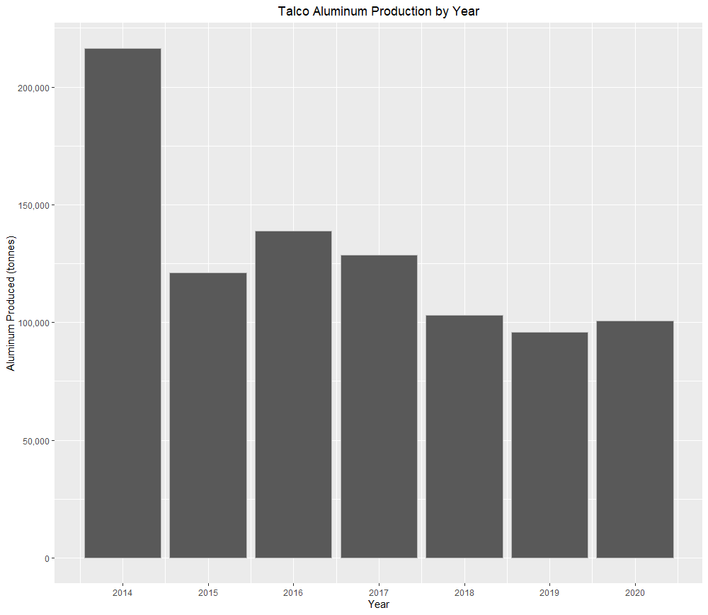
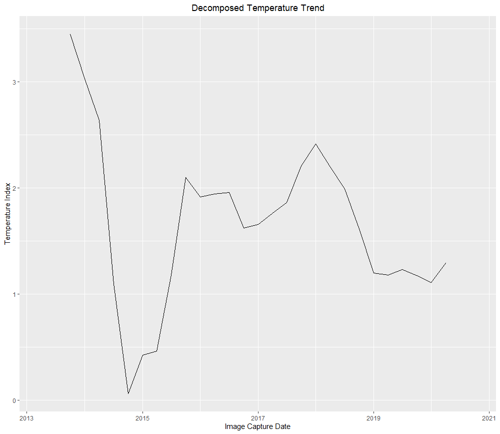
While there is divergence between the temperature measurement and production in 2018, there is a general correlation and this technique clearly picks up the large production cutback that occurred from 2014 to 2015.
This work could be further extended if you were able to monitor more factories associated with a larger company. Here it would be interesting incorporate the temperature measurements with other forward looking information about the company, using temperature shocks as a time series break.
